BigHit Music first revealed the identity logo for BTS’s fifth studio album in late December 2025 through a handwritten letter from the members expressing gratitude to fans after three years of waiting for the group’s return. Since then, the album’s distinctive red logo has drawn the attention of fans worldwide, appearing across major cities—from the Sejong Center for the Performing Arts near Gwanghwamun Square in Seoul to New York, Tokyo, London, and Paris.
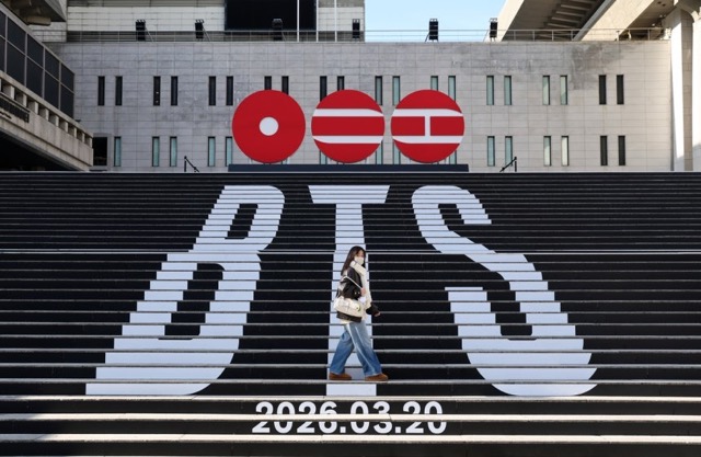
Believing that nothing in BTS’ world is ever simple, fans came up with various theories to interpret the red circular symbol for nearly half a month. In the end, the only thing they got right was realizing that the circles and lines actually represented a name — “ARIRANG,” which is also the album’s official title.
What surprised and delighted fans even more, however, was the fact that one of the seven members was actually the person who designed it. The members υиєχρє¢тє∂ly revealed this during a group livestream not long after the album title was announced. And the person behind the iconic red circular logo was none other than the golden maknae, Jungkook!
Jin proudly shared: “Our Jungkook said, ‘What if we did it like this?’” Jungkook then explained: “When we were working in the US, I made about four sketches and sent them to the company.” RM added: “Jungkook was working hard on…” and Jin described: “He was drawing.” The leader further explained: “Yes, he was drawing on the notepad. It was meant to be ‘ㅇㄹㄹ,’ and I thought people wouldn’t be able to guess it—and I think people didn’t?”

Notably, since the ARIRANG album logo was released, some major brands have even drawn inspiration from Jungkook’s design. One notable example came in May this year, when the Seattle Seahawks, an NFL football team, posted an image featuring a redesigned version of their logo in the style of BTS’ ARIRANG logo and tagged BTS’ official account, @bts.bigнιтofficial.
While BTS's album logo primarily uses red as its signature color, the version shared by the football team adopted the Seahawks' iconic navy blue palette. The details inside the logo were also redesigned to reflect the team's identity: one circle featured a stylized seahawk emblem, another depicted Seattle's bridges, and the third displayed the number 12, a symbol representing the team's pαѕѕionate fanbase. Beneath the emblem is the phrase “12 AS ONE,” echoing the same theme of unity and togetherness found in the ARIRANG album.

When it was revealed that Jungkook had designed the album logo, fans were both surprised and thrilled. However, the revelation also felt natural, as the Golden Maknae has long been known for his artistic talent. He previously drew a stunning landscape painting on the show BTS In the SOOP, leaving j-hope so amazed that he exclaimed, “What world are you from?” while RM remarked “Bob Ahjussi,” implying that Jungkook’s talent rivals that of renowned αмєяι¢αn painter Bob Ross.

Jungkook also has a history of contributing artwork to BTS’s music-related projects, including a portrait of SUGA, cover art for Seesaw x I Need U Remix, and visuals for his solo project GOLDEN. Now, with the addition of the deeply symbolic ARIRANG logo, he once again vividly demonstrates his boundless creativity.

Fans expressed their αωє at the youngest member of BTS and voiced deep admiration for his multifaceted talents:
- ㅇㄹㄹ from the initial of 아리랑 (arirang)??? d*mn so genius man. Our jungkookie worked hard and designed logo
- Our talented golden maknae he's so hard working ilhsm. HES SO SMART AHHH THE SYMBOLISM
- We had many theories about it but we couldn't guess who designed it. So proud of our Maknae
- Jungkook is truly incredible. The way he works so seriously, even when he’s just drawing, shows how pαѕѕionate and dedicated he is. It’s impossible not to admire him.
- Made the most eye-catching BTS logo,Golden maknae for a reason
- no wonder we were all drooling over the logo even before knowing the album, everytime jungkook touches soмєтнing he turns that into gold
- Not Jungkook casually working hard and drawing soмєтнing so subtle that only sharp eyes could catch it. That’s so him quietly talented and thoughtful.
- jungkook designed the logo for their album with ㅇㄹㄹ from the initial of 아리랑 (arirang) !!!! he’s the coolest omg i’m so proud of him
- You know it's a good logo when you close your eyes and you can see it in detail. Kookie did a great job. Simple, meaningful, impactful and memorable.
- and people were sнιтting on this logo not knowing that jungkook drew it..oh they’re such a bunch of losers